 Today, this is where I'd like to be, in Isaac Mizrahi's bathtub (sans Isaac Mizrahi, of course). His Manhattan home, a historic 1931 building (hence the radiator in the bathroom), was featured in Architectural Digest not too long ago. Although the rest of the home reflects his modern, colorful essence, I love the simplicity of the bathroom, the modern rigid lines and natural light. See more, here.
Green Eyes: Treillage in Lyford Cay
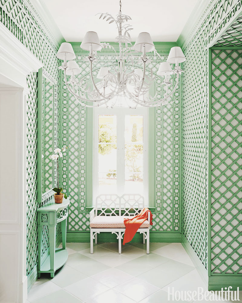 I'm quite mad for trelliswork in general, I love how it can exude such sophistication in spectacular gardens and facades on grand buildings, yet it can stand alone casually and timelessly in a beach home like the above retreat in Lyford Cay. At the request of interior designer Amanda Lindroth, the elaborate design, featured in House Beautiful, was commissioned by Philippe Le Manach from Accents of France. Based in California, Accents of France specializes in custom and decorative treillage inspired by 18th century French Designs. The company has worked on projects around the globe and aside from breathtaking work with custom interior and exterior spaces, the group also designs custom planters, jardiniéres, obelisks, vases, urns, lighting and furniture (see portfolio here).
Below, a note from Accents of France's site that speaks to the history of treillage:
It wasn’t until the 17th century, under the reign of Louis XIV, that the art of treillage would rise to unseen heights. The King hired emerging landscape architect André Le Notre to design his garden at Versailles; an elaborate design that would soon become the most impressive formal French garden the world had ever known.
Le Notre and other landscape architects like him, relied heavily on forced perspective to bring a sense of grandeur to the garden. While it would have taken years for hedges and topiaries to grow to full maturity, treillage brought instant architecture, impressive scale and elegant formality to a newly built landscape.
Sea Captain & Sag Harbor

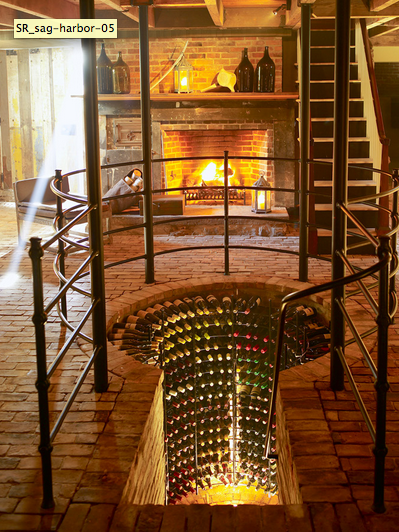

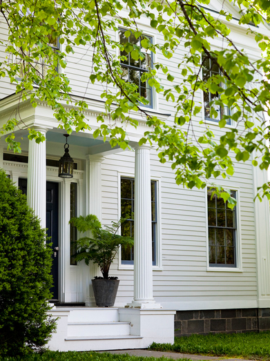

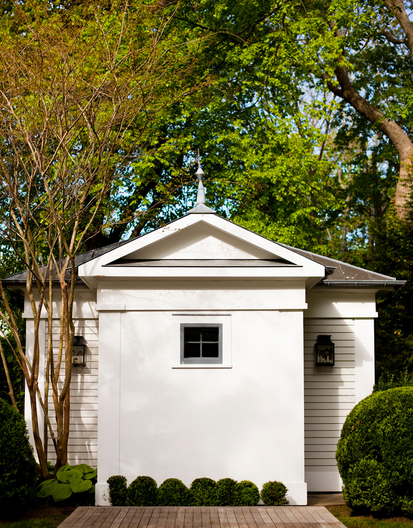
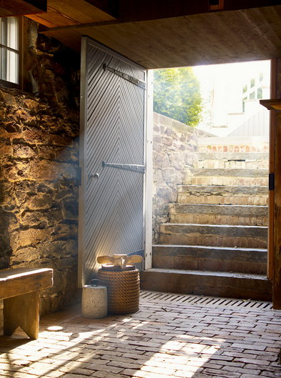 The above home in the village of Sag Harbor was mostly a renovation project, however it remains to be one of my favorite projects by interior designer Steven Gambrel. Built in 1835, the home is just one of Gambrel's country portfolio projects. (My other favorite is Red Craft, a 19th century estate in Southampton). You could lock me in that wine cellar and throw away the key as far as I'm concerned, that room is a thing of genius design.
C&C Profile: Mark D. Sikes

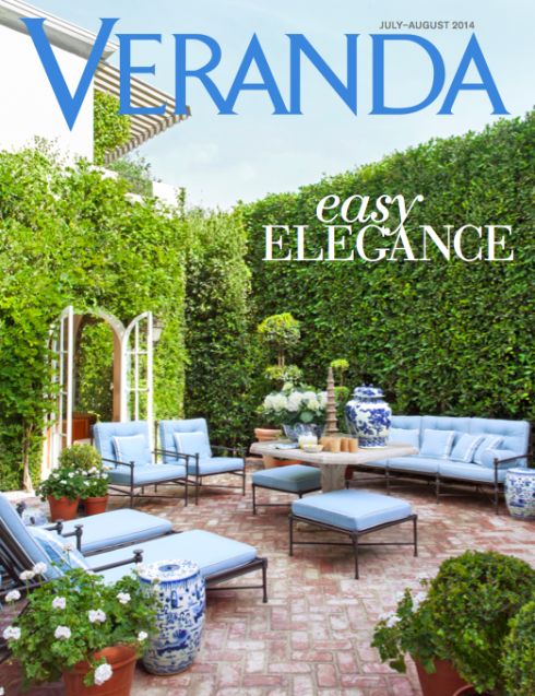





 I couldn't be more thrilled to share with you a fun Q&A with Mark D. Sikes. I've followed Mark's lifestyle blog for ages and can confidently say he is a true connoisseur of chic. His daily record of "chic people, glamorous places and stylish things" is part of my morning reading routine and Mark's narratives and imagery always make my heart pitter patter. His home in the Hollywood Hills, one of my personal favorite interior and exterior spaces (and also above), was featured in Veranda Magazine's 2014 July-August issue (including the cover!). Stay connected to Mark by subscribing to his blog, following him on Pinterest and Instagram. Read-on, below:
C&C: For starters, Mark, I love your blog! We both know that it takes a lot of work to curate and compile content, but that’s easy with being inspired. Tell us about your methodology in collecting content for the blog.
Mark: Well, I really don’t know if there is a method to the madness, I just save images and ideas as I find them, my desktop on my laptop is quite full! I do read a lot and I do stay on top of everything in design, fashion and news daily- I have come up with a daily routine that seems to work….
C&C: You studied finance and economics in college with the intention of having a career in international business. By the looks of it, that career path didn’t exactly take shape! When or how did you discover you had a different path ahead of you? (Was there an “aha” moment?)
Mark: When I got out of college, I started to look for jobs…I was living in Nashville with my parents…I got a few part-time jobs, one at a fashion retailor and another as an assistant at an interior design firm…I enjoyed both and felt connected…when you love what you do, you are happy…from there things fell into place…I guess that was my “aha” moment- it’s truly been a beautiful and fun journey!
C&C: One of my favorite components of your blog is the “MDS Interviews” feature. I won’t ask you to pick your favorite interviewee…any hints as to who might be on deck for your next feature?
Mark: There are a few interior designers coming up, If I tell you who they are that will spoil the surprise, and then a few ladies whose style and elegance I admire…. And who knows there might soon be some actors, actresses and editors coming up too…
C&C: You write about your favorite “Glamorous Places”. If you were to magically slip into a scene from one of your most cherished glamorous places, where would you be and with whom?
Mark: Most definitely to La Colina, Bunny Williams and John Rosselli’s home in Punta Cana…it’s the most beautiful place…it’s my ideal…and I would want to be there with dear friends….
C&C: Is there a particular (fashion) item you are looking forward to coveting this Fall?
Mark: I guess just more navy and grey cashmere crewnecks… I kind of have a uniform, I tend to collect more of the same…boring I know, but I love what I love….
C&C: I swooned over the photographs (and cover!) of your home in Veranda’s July-August 2014 issue. Is there a particular space in your home you adore most?
Mark: To be honest I love every room, we use every room, but if I had to pick one it would be the tented library…the room is full of all my books and magazines. There is a day bed in the middle of the room, I find myself in there a lot….. it’s a space that I feel inspired in!
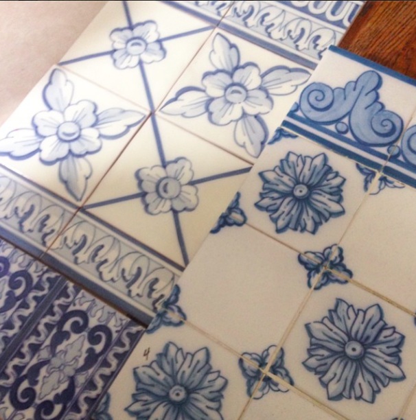
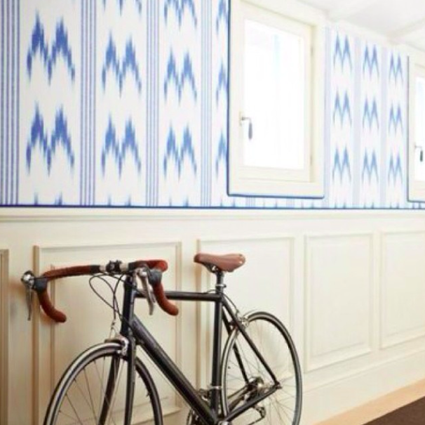
C&C: Those that know the true essence of Mark D. Sikes are well aware of your affinity to all things blue and white. I’ve asked you to share with us some blue and white items from your Instagram account you so adore (photos above). Can you please speak to those pieces and your connection to each one?
Mark: I’m mad about antique blue and white ceramics, I have a very large collection, I love blue and white Portuguese tiles, and there has never been a blue a white stripe I didn’t love- I love to wear blue and white stripes and I love to decorate with them!
C&C: Do you have any pet peeves when it comes to decorating or manners?
Mark: I don’t have many pet peeves when it comes to decorating, I have my own rules, but that doesn’t mean they are right or wrong, and you know rules are made to be broken…everyone has there own taste, that’s what makes the world interesting and beautiful. In regards to manners, just be thoughtful, considerate and kind, it’s not hard!
C&C: What’s currently on your nightstand at home?
Mark: A picture of my partner Michael and lily (our French bull dog, better known as HRH Lily), there’s always a stack of magazines, possible a new design book, hate to say it but my phone and computer charger is always present, a carafe of water, fresh cut flowers, an ivory shagreen box with a pen and post its- I make lots of notes in the middle of the night!
Images above are from Veranda Magazine, Mark's Instagram and property of Mark D. Sikes.Getting it Right: Typeface
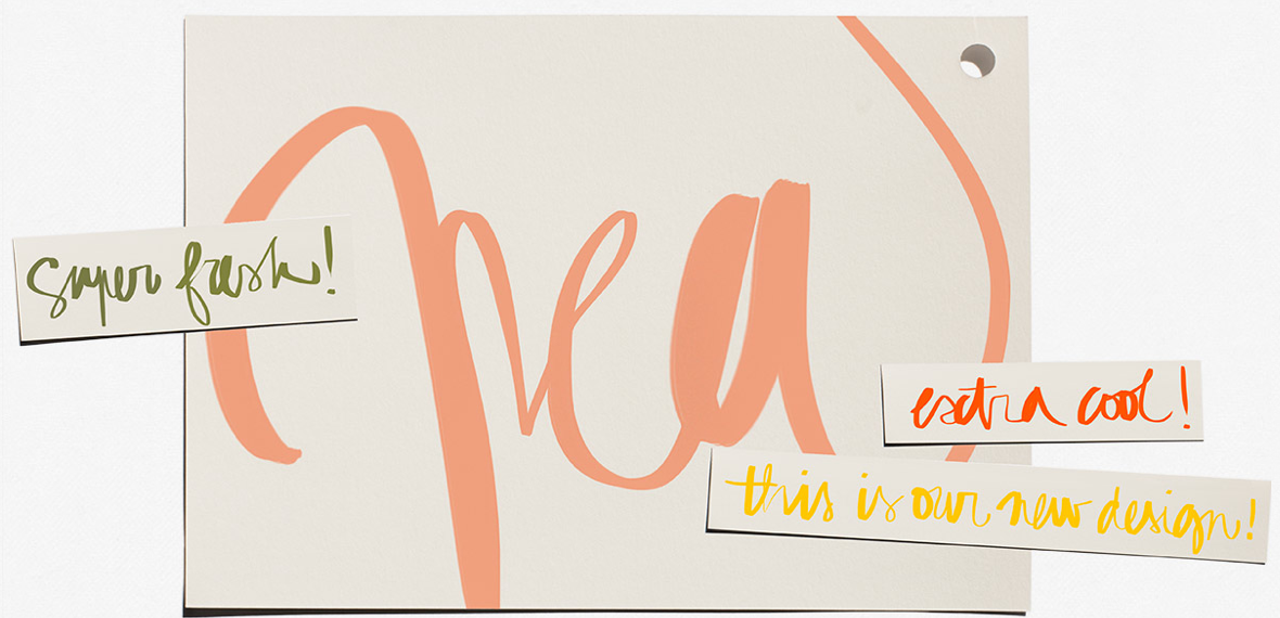 Garance Dore just gave her blog a facelift thanks to the fabulously french talents of Colorz, a digital strategy agency.
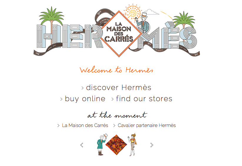 In true Hermès fashion, they have brought play and style to e-commerce. Their graphics and font provide a well-rounded web experience.
  Meredith Melling and Valerie Boster's creative consultancy has a sharp but concise web presence. I suppose that is to be expected for the former Vogue editors...
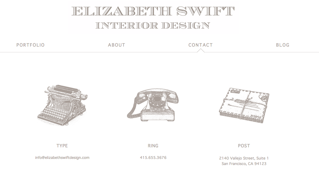
The chic San Francisco interior design firm Elizabeth Swift Design just launched their site and I'm loving the graphics and font on their "contact" page.
I'm working on a new project for a client and love exploring different typefaces. Typography, the art and craft of arranging and designing type to make the written language most alluring, can have a dramatic influence on how the brand or product connects with the consumer. Above are a few typefaces and designs I'm currently coveting.
Getting Frank...with Chic Textiles


 I met Christina Bryant at one of the first dinner parties I attended in San Francisco close to three years ago. We swapped life stories over vino and hors d'oeuvres as I quickly developed my "girl crush". I was immediately enamored by Christina’s views on international development, her tales from her travels in Africa and the surrounding globe, her graduate work at Stanford, her entrepreneurial spirit, and overall grace and gumption. This girl had it all happening.
There is nothing more inspiring than seeing your friends and peers pursue their dreams and it gives me a great deal of pleasure to introduce you to Christina's remarkable company, St. Frank. St. Frank launched in October of 2013 as the only retailer of framed textiles. All of St. Frank's pieces are handmade by artisans around the world in low and middle-income countries, each one showcasing a traditional craft with rich stories. Central to the company's model is what they define as a two-fold mission: supporting economic empowerment for artisans, while preserving and cultivating the traditional craft. Each unique item is truly a conversation piece, and a chic compliment to any space.
Above, you'll find an assortment of pieces from St. Frank's vintage collection. In addition to these pieces, I encourage you to view their newest collection: Coffee & Chocolate. Impressively, St. Frank has received a multitude of praise from Harper's Bazaar, Traditional Home, C Magazine, Lonny Magazine and the like. C&C wishes Christina and the St. Frank team continued success!
Office Inspiration: Grégoire's Gem

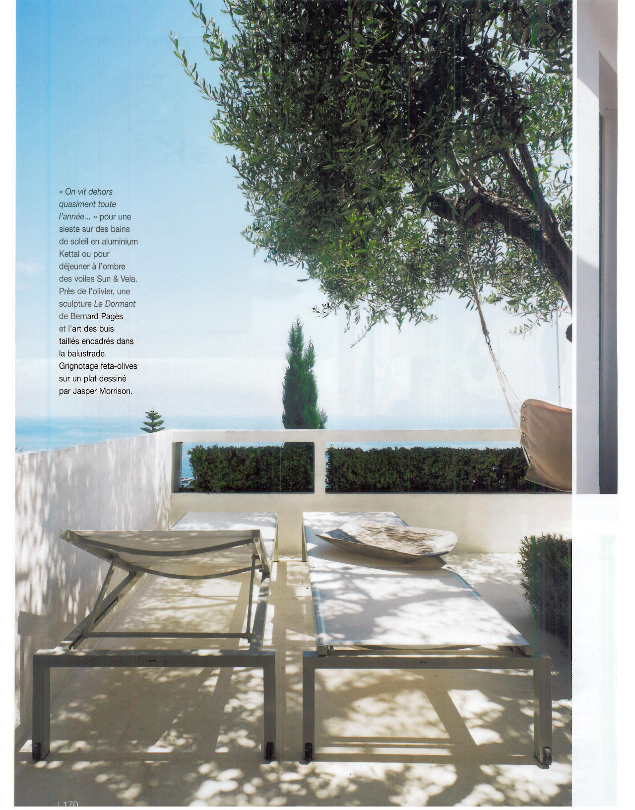
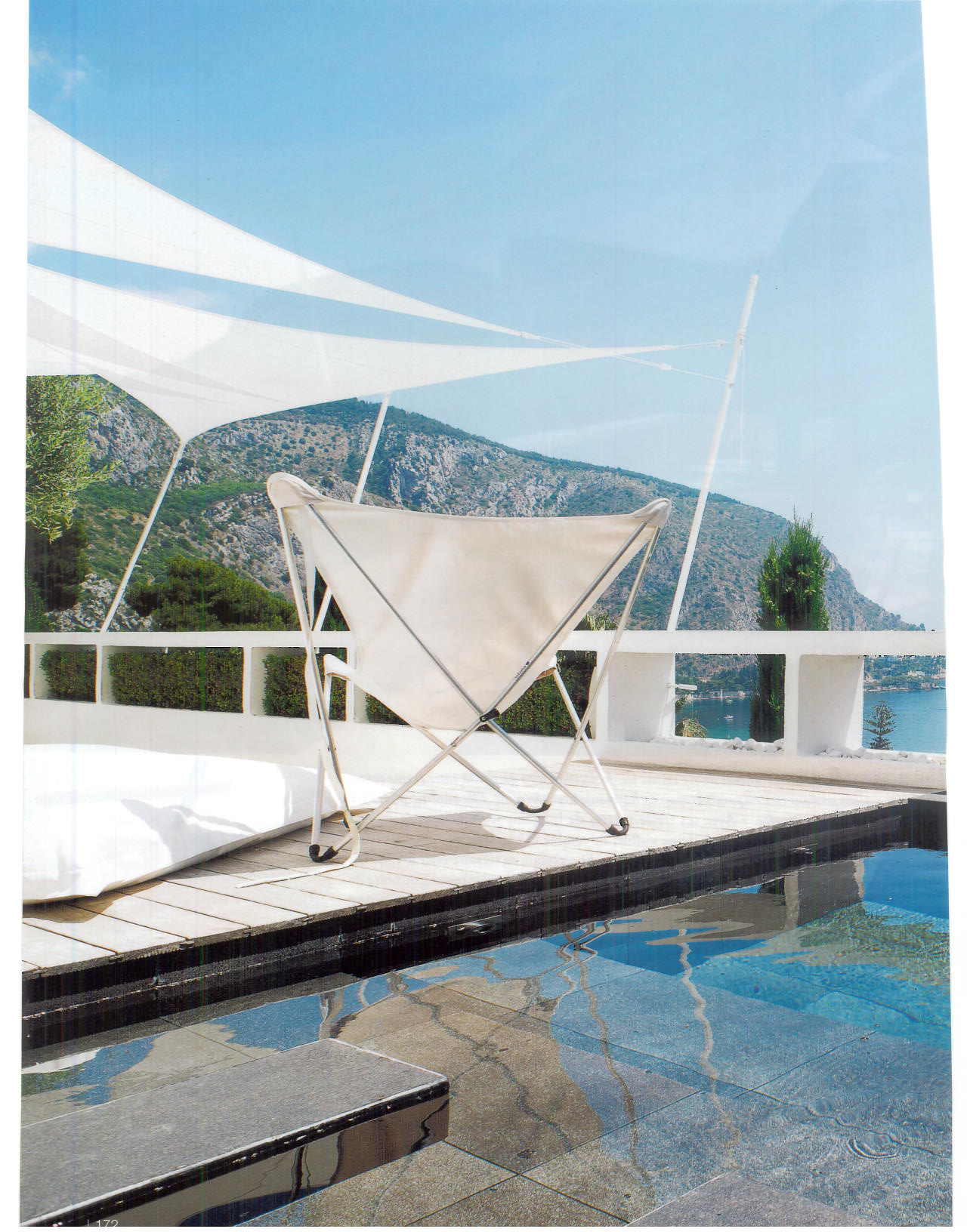
 One of the perks of now working at an interior design firm is the sheer joy of being surrounded by tangible inspiration all day long. I am deeply affected by the landscapes in which I live and work in, and my new work environment makes me truly happy. Instead of the interior rigidness of a financial institution, I am now surrounded by a flood of rich fabrics and textiles, architects drafting elaborate blueprints, a sea of French antiques, and, a library full of auction and design catalogues. Thus, I bring you my latest obsession. If I could jump in to this landscape, I would. The images come from the French design publication Côté Sud and depict the most idyllic residence on the French Riviera. The vacation home belongs to Grégoire Gardette, legendary photographer, designer, publisher and graphic designer. Now all I need is a new white bikini, my Bain de Soleil and a tall glass of Pellegrino - dreamy!
In addition to salivating over the serene scenes above, be sure to view Grégoire's portfolio, here: http://gregoiregardette.com/fr-en/
Mark Your Calendar: SF Decorator Showcase
 The Decorator Showcase is my favorite annual event in San Francisco. This year, I am particularly excited about the house selected, as I have been mesmorized by the ivy-covered home ever since my first walk in the Pacific Heights neighborhood. Last year, the home sold for $18M making it one of the most expensive (residential) real estate transactions within the year. It should also be mentioned that it sold above asking price. (For those unfamiliar with the San Francisco real estate market, this is more common then you would think).
The Decorator Showcase will be open from April 26 - May 26 this year, showcasing the work of over twenty six interior and landscape design firms. The event, open to the public, is a fundraiser for the San Francisco University High School. Last year, the event raised over $622,565 (net).
I reccomend attending the event on a weekend morning or after work. It's a wonderful event to go to with friends who appreciative design, and also makes for a fun pre-dinner date activity.
To learn more and purchase your tickets, visit here.
Bahama Mama
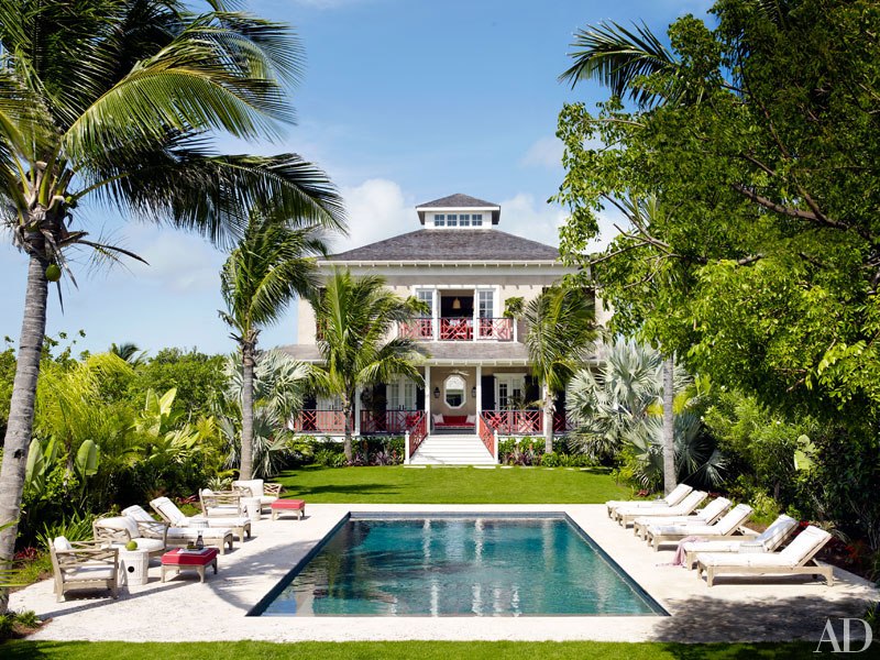


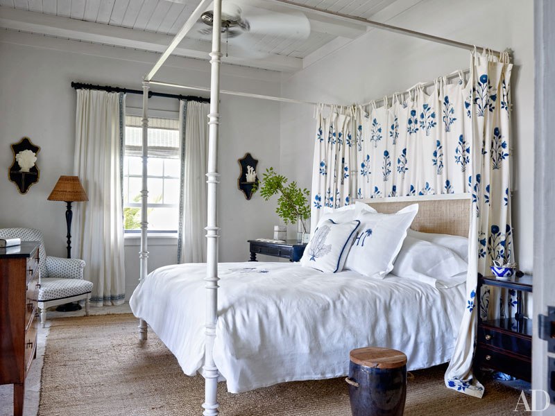
 When I began constructing this post, I realized I had inadvertently created a theme I seemed to be following. I do have the itch to travel and find myself recently intrigued by island homes and the lifestyle that inevitably accompanies. (If you missed "The Good Life" post, you can get caught up here). There is something to be said about jetting off to a home-away-from-home to enjoy the simple pleasures you so adore.
I loved reading about Alessandra Branca's Harbour Island getaway. The photographs that accompanied the piece made me love sick for pink skies, refreshing cocktails, afternoon island breezes and the ease that comes with such landscape. I particularly like that Alessandra, a Chicago based interior designer, chose a deep coral-red as one of the prominent colors in her designs. The color compliments the lush greenery and natural colored textural elements throughout the home, lending to a cohesive yet non-fussy look. See the feature in Architectural Digest here.
Garden Party Ready


 Admittedly, this particular catalog is usually put in the stack of discarded mail, however this month, it gave me pause. The cover is perfectly enticing and all things Spring, showcasing a garden oasis with two chic seating areas. It is a scene I would teleport to in an instant - truly my definition of heaven. If you're in the market for outdoor furniture, I encourage you to look at Frontgate. Currently, they are offering 20% Savings on all furniture sets. My pick? The Grayson Collection in white with jade cushion fabric.
Images via.
