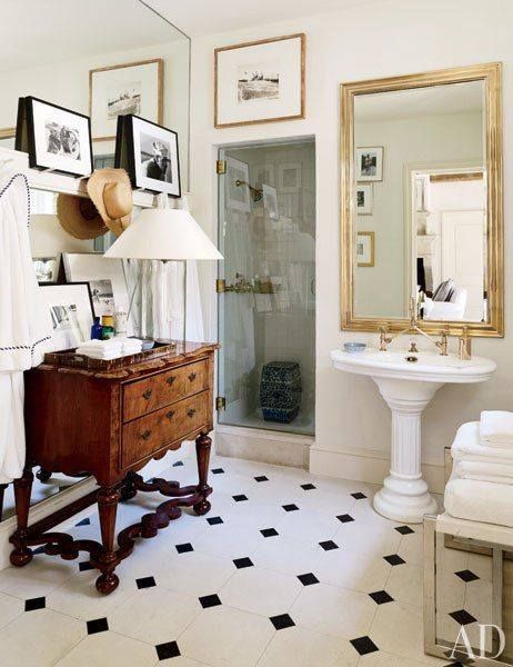
 Do you ever look at photographs of interiors and think about what you would have done differently? I go through this thought process constantly and find it's a natural reaction that can often help shape your own design palette. The above is Ralph Lauren's poolhouse bath in his Bedford home. I'm particularly drawn to the layering element thanks to the vignette of photographs and gorgeous table lamp on the bureau. I also love how the French bistro mirror commands the space while adding more depth to the room. (I have a thing for gold frames). There is an element of sophisticated ease that really speaks to me.
Although I am a fan of pedestal sinks despite their lack of surface space, I find this particular sink a tad too dated. I would love to see a pedestal sink with just a hint of modern shape while still keeping its traditional elements. Lastly, I absolutely despise the tile. I'd love to see a basket weave or hexagon marble tile to add a little sleek dimension and deter away from early 90's meets "looks like Kris Jenner picked the floor tile" vibe.
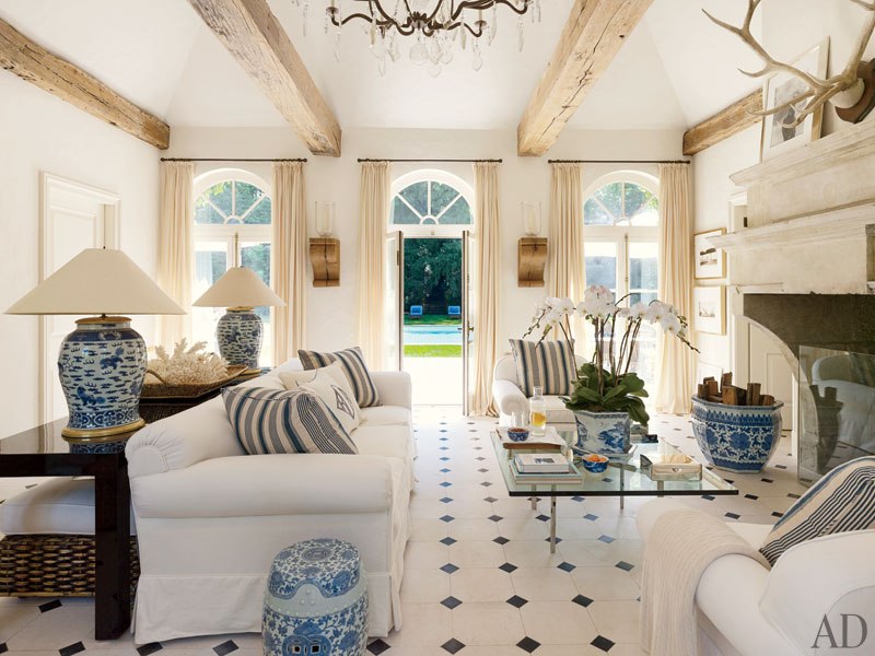
Even an area rug and different floor tile in the living area of the poolhouse (below) would do wonders! Woulda, Coulda, Shoulda...

